Graphic Design Projects


Forest Cove Consulting
The logo for my father's consulting business. I thought the name was just a really great one, and came up with a design shortly after hearing it. This is the revised design, where I'm going for a quasi-Oriental brush stroke motif in the art work.

Buglist
Buglist was a program I wrote while at Oracle to manage the Oracle bug database, so that developers could get told automatically when the support group changed the status of one of the bugs they managed. The phrase "Track 'em and whack 'em" for some reason floated across my brain while I was hacking on the code, and the result was this logo.

MTG Website Icons
As the webmaster of the Guild since 2000, I've created several small images to represent upcoming shows. These are often replaced with different images when a publicity designer is selected, but I like many of these, and it's nice to show them off here.
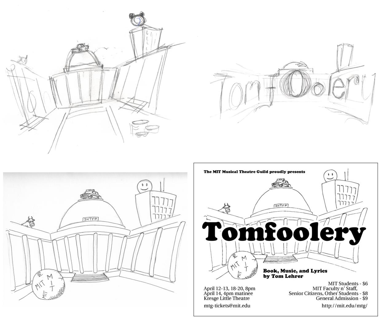
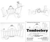
Tomfoolery
Tomfoolery is a collection of songs by Tom Lehrer, and the director was interested in linking Mr. Lehrer's satirical bent (and connection as a former MIT lecturer) with the MIT hacking culture, and so this set of sketches made during auditions ended up being the logo design. The design references several well-known MIT hacks, including the 1982 Harvard-Yale balloon, the police car on the dome (1994), the smiley face on top of the Green building (1983), and the cow that made its way to the roof of East Campus in 1928.
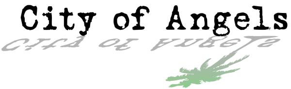
City of Angels
City of Angels is a film-noir musical, with half the action taking place inside a black-and-white film, and the other taking place on a color set, showing the film's author hammering out the screenplay. This logo combines the look of a 1940's typewriter, a palm tree to evoke the California setting, and emphasis on the transition between grayscale and color.

Evita
The "elevator button" logo for Evita 1999. I was called on as publicity designer kind of at the last minute, but did one of my usual grayscale designs. Turned out reasonably well, though.
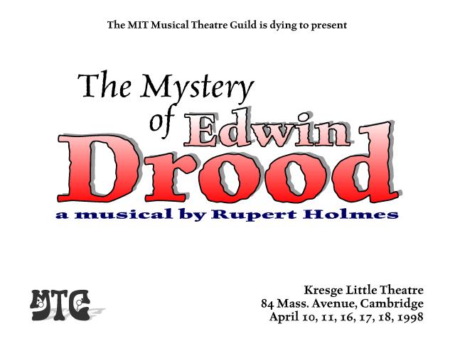
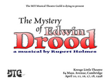
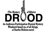
Mystery Of Edwin Drood (1998)
When I returned to MIT in 1997, I soon found myself doing publicity for yet another production of Mystery Of..., and came up with yet another campaign. This one was really fun, and resulted in a large series of various ads that appeared all over campus. This particular image is the opening card from the videotape made of the production.
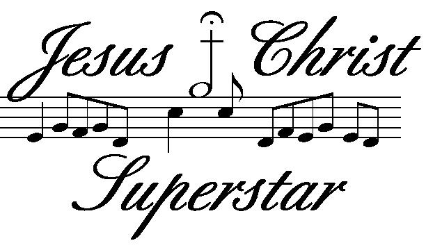
Jesus Christ Superstar
I'd left MIT by the time this show rolled around, but I had a striking idea for a logo and I followed it through and kept it around for my own amusement. I always liked the idea of having a staff of notes, where the notes represent characters in the show in a neat way. This idea implements that to some degree. In 2004, the Guild decided to do the show again, and I used the image as a placeholder.
Tech Show Logo
A simple design for a tech show logo. Tech Show is the moniker for an MIT student-written musical production, which had a long and checkered history. They were trying to come back during the early 90s, but ended up not returning until 1997's production of Robots. The Tech Show art deco font was my own version, vaguely based on the Broadway font of old. The same font appeared briefly in designs for Anything Goes and Cabaret (hey, if something works, you go with it!) In truth, this design never left my computer, but I always liked the various use of gray levels.

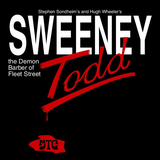
Sweeney Todd
One of my favorite designs, as it was originally conceived. Unfortunately, it was surprisingly expensive back then to do good images on black backgrounds, and so we settled for having a black and red on white background design. Still, I've always liked the brush stroke in blood, collecting in a pool with the MTG logo.

Mystery Of Edwin Drood
One of my first designs, for the Guild's 1991 production of The Mystery of Edwin Drood. The logo was part of a campaign that worked surprisingly well, with a giant jigsaw puzzle on MIT's main corridor asking passersby to "Help Solve the Puzzle". The logo design was also reproduced on a shirt with the phrase "I killed Drood!", which the production staff gleefully insisted the director wear. Some nice comments were made about the logo, but I did get someone asking me who "Dr. Od" was, though.
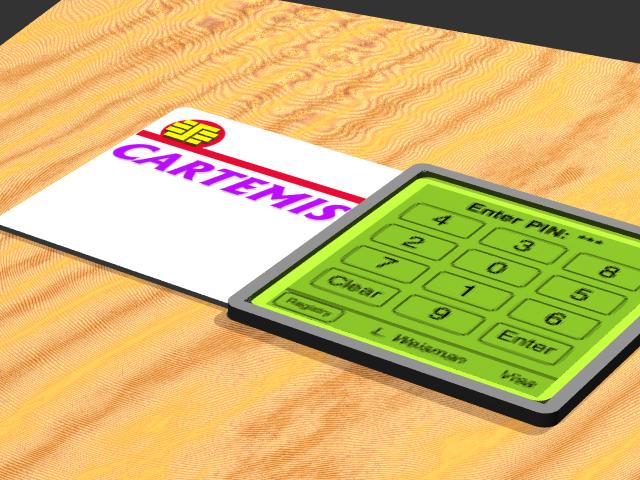
Cartemis Smart Card
This picture was generated to support a presentation I made December 1998. The design is for a smart card with integrated LCD display for entering PIN numbers. The design allowed for multiple applications, and small size because all power would be handled by the card readers. (In case you're wondering, the numbers on the keypad can be randomized so that someone can't figure out your PIN by looking at the wear on the display.)
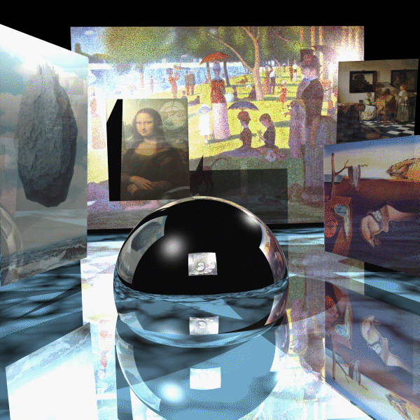
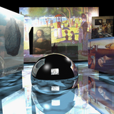
The Virtual Gallery
This image was inspired from the April '95 cover of Scientific American. It features paintings from several artists, all texture mapped onto different surfaces. The floor is a light blue marble, with a perfectly reflective gazing sphere sitting in the middle.In the name of art, I've chosen the artists and pictures carefully, for what I feel would be their interest in the way computer graphics can represent the world. They are, from left to right:
Rene Magritte's "Le Chateau des Pyrenees". (1959) Magritte had a unique interest in the melding of image and reality.
DaVinci's La Joconde, best known as the Mona Lisa. (1503-06) DaVinci had one of the best eyes for perspective of all painters of his time...it's interesting to note that the features of the Mona Lisa may, in fact, be closer to DaVinci's own face than that of his model.
George Seurat's "Sunday Afternoon on the Island of La Grande Jatte". (1884-86) Seurat was one of the first to really experiment with the ability of a limited palette to represent every color in the rainbow. Witness that all of our images today seem to only have red, green, and blue in them :-)
Salvador Dali's "Persistence of Memory". (1931) Actually, I just always thought this print looked cool, so it got added in.
Jan Vermeer's "The Concert". (1665-66) Vermeer had one of the best eyes for the way light could fill a scene. His "Music Lesson" is used as the inspiration for the cover for Foley, Van Dam, et al. as a radiosity example. A similar effect is in this work. If you happen to see this painting in real life, please notify the authorities -- it was stolen from Boston's Gardner Museum in 1990.
Finally, in the gazing sphere (and a little bit in the reflection off the Mona Lisa), you can just make out M. C. Escher's Dewdrop (1948). Escher loved to study reflections, especially self portrait's in gazing spheres...I think he would love to see how a ray tracer can accurately model the reflections inherent in most of his work. Unfortunately, at this resolution, it is far too difficult to examine that work.
This image won an "aesthetic honorable mention" in the class's rendering competition.

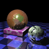
Spheres and Cubes - Deformed
Every single surface in this picture, with the exception of the cube in the center of the left-hand sphere, has a different kind of procedural shader attached to it. The gold sphere has been dented badly, although the cube is visible inside. The pedestal is a simulated marble, and the silver sphere is eroding away...
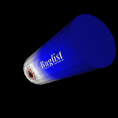
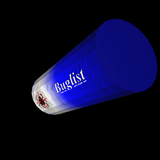
Buglist Canister
Just a fast test image, wrapping the Buglist logo around a crude cylinder. The can has also been dented, as well...

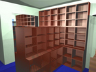
Bookcases
This was an image done with POV-Ray, in which I was trying to get a look at some bookcases being ordered for my home library. The room dimensions, bookcase sizes, and colors are all very close to reality.
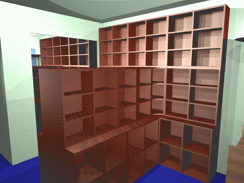
This is the same model, seen from a different vantage point.